Ang Dila Snack Bar
Restaurant Branding
Creative Concept
Logo
Illustration
Packaging Design
Copywriting
Motion Design
A snack bar identity turns Filipino rituals into cues for brave bites.
-
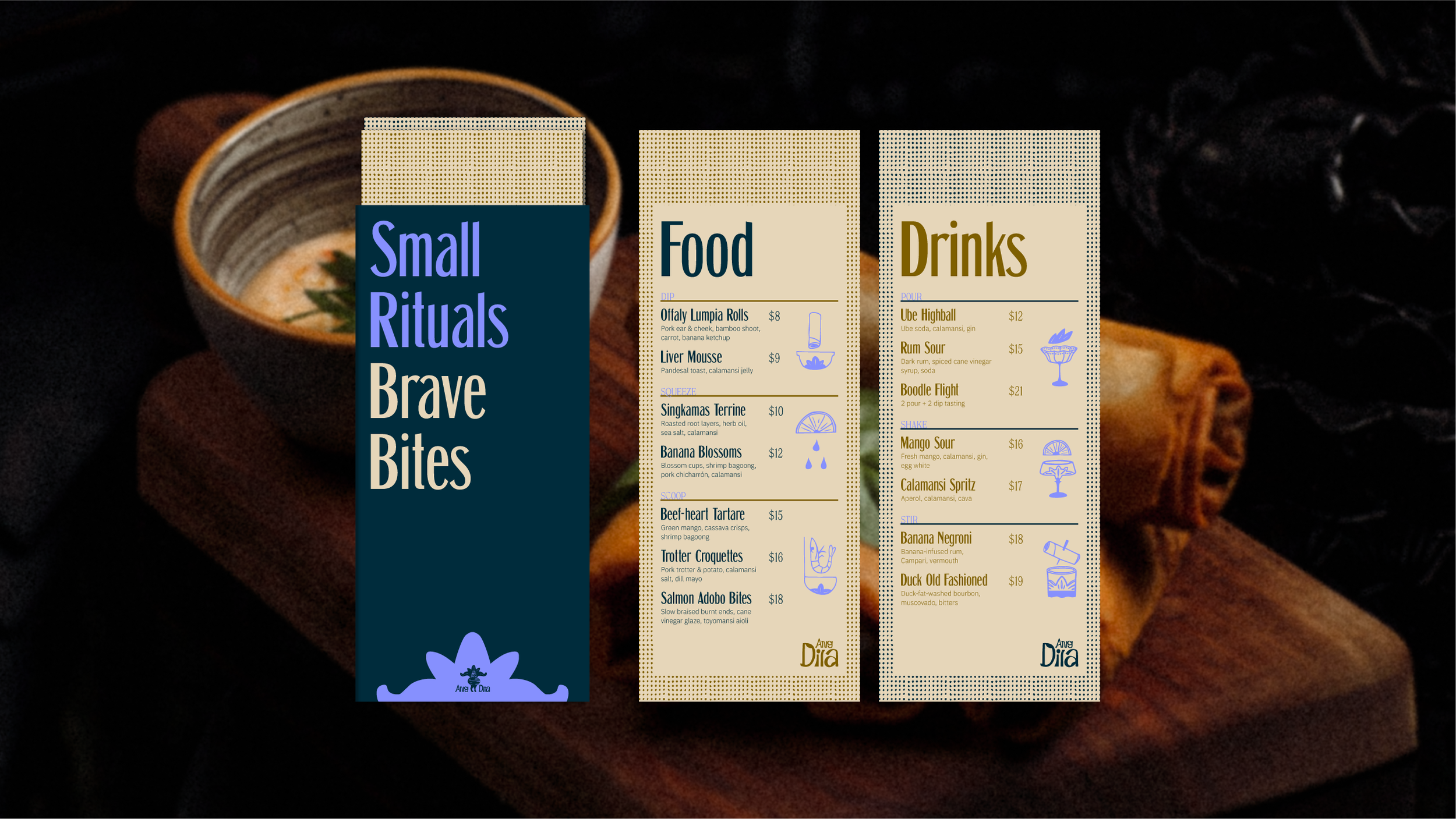
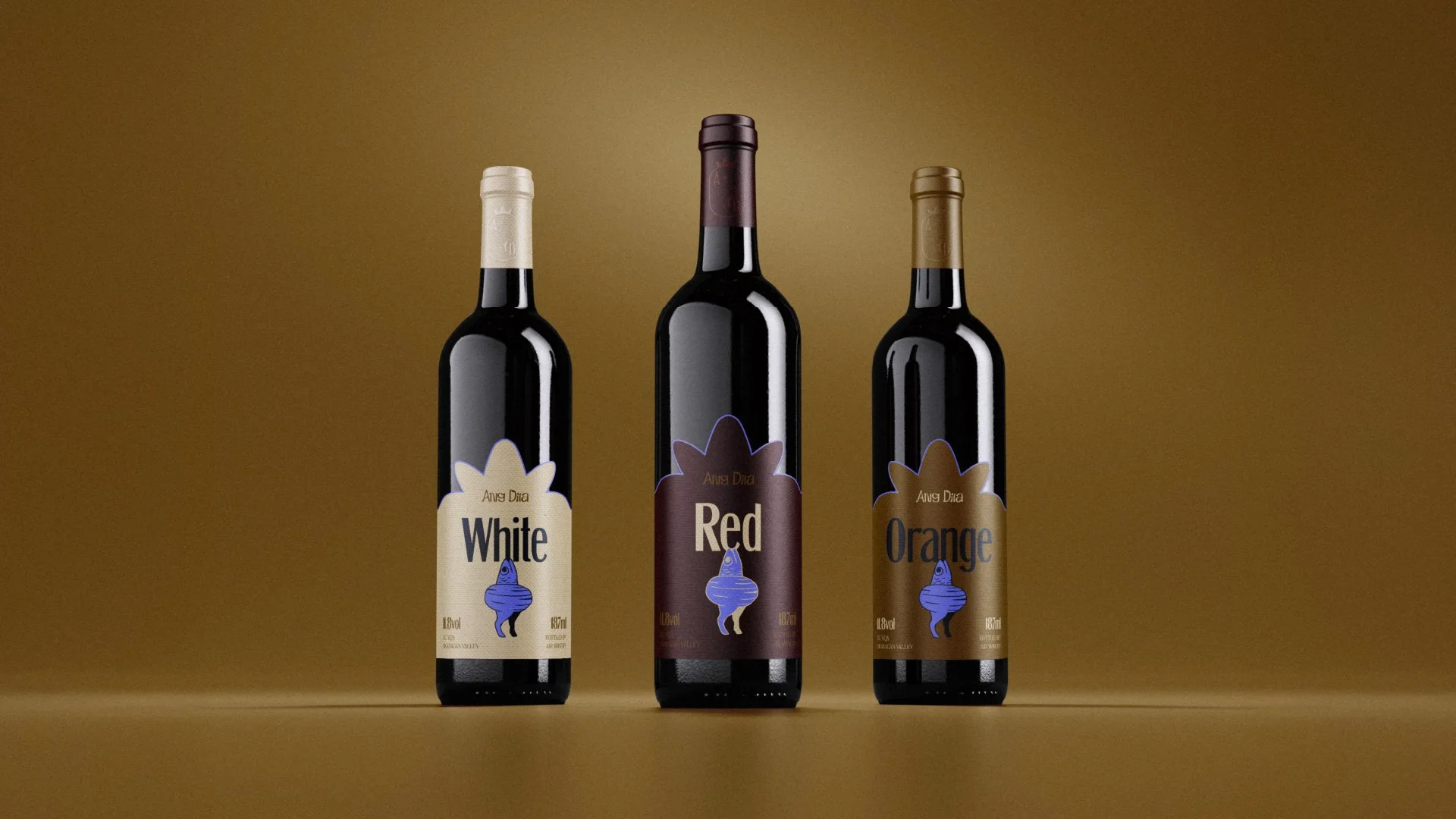
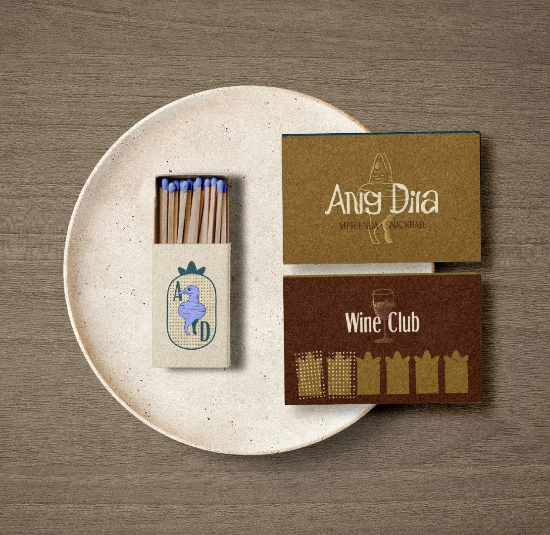
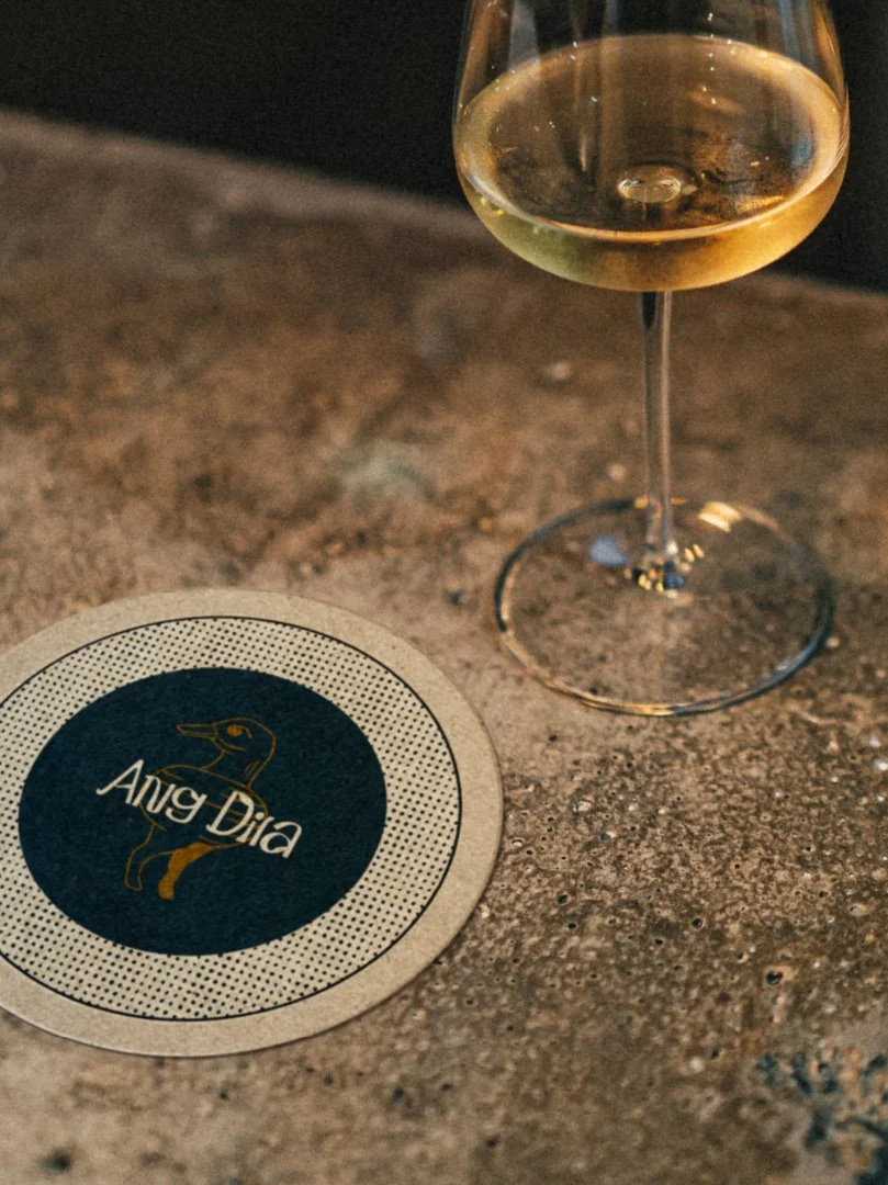
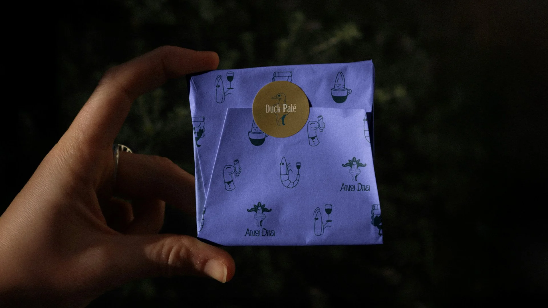
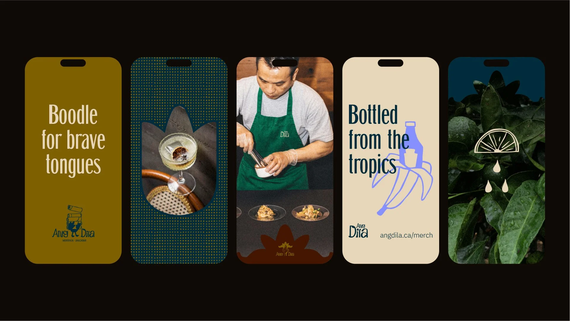
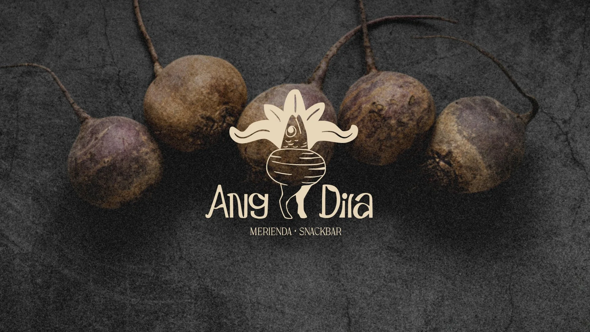
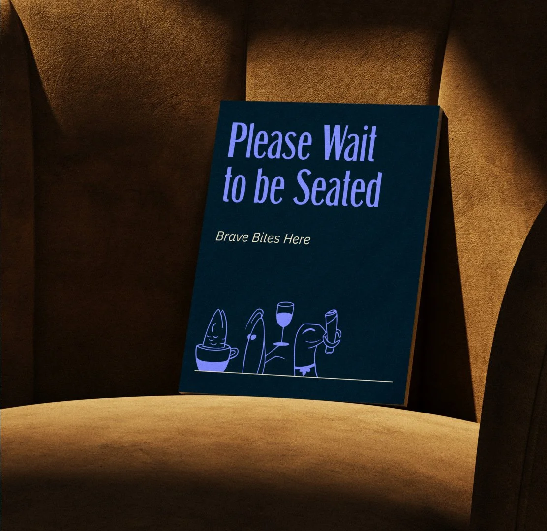
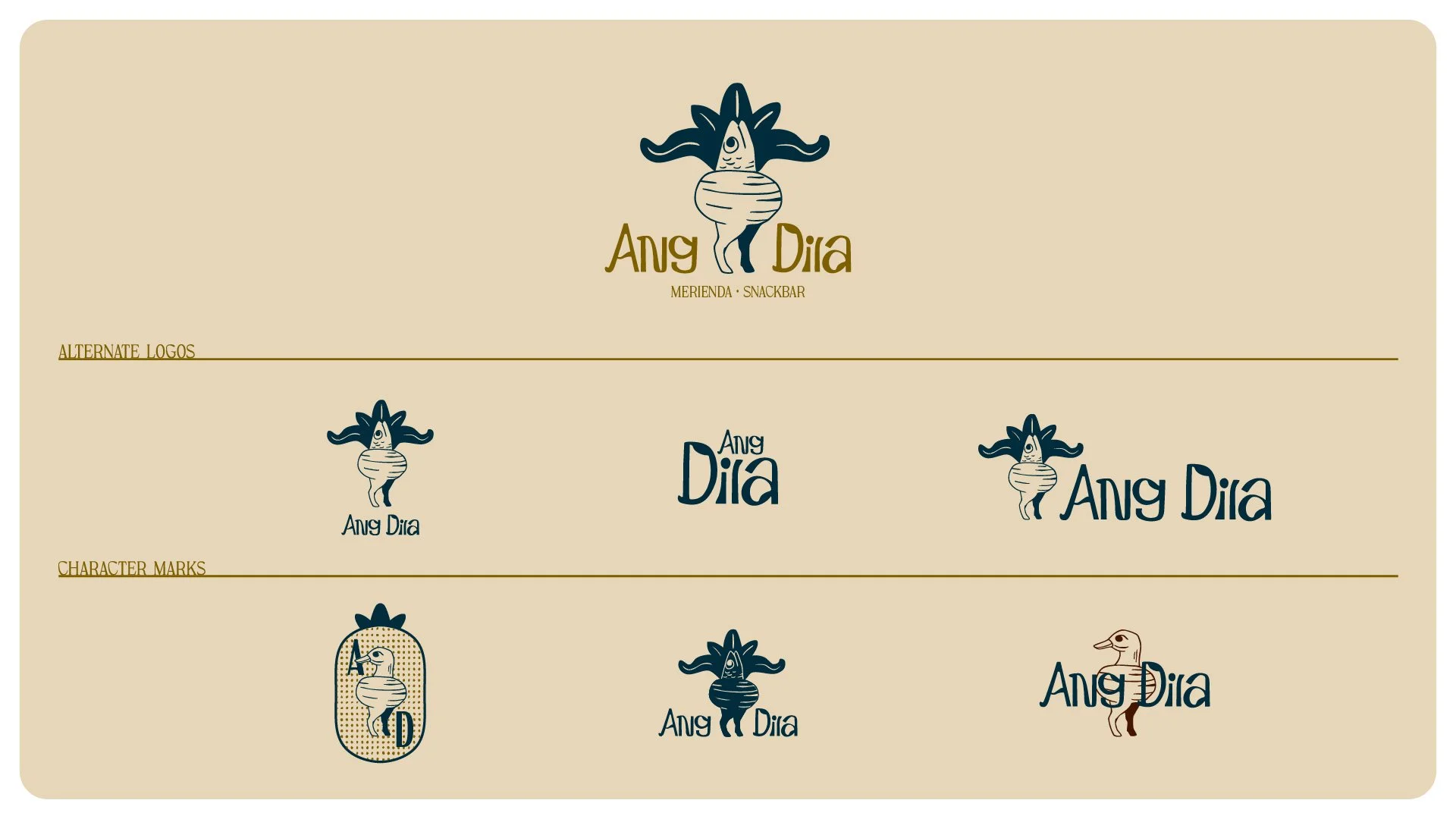
Ang Dila, meaning “the tongue” in Tagalog, reframes Filipino offal-forward bites as a concept snack bar. Built around the idea that Filipino food is often underestimated but led by pride, the concept uses condiments of Filipino food culture as a gateway to braving the bite.The visual system draws from the details of the Narra chair, a traditional table that represents Filipino welcome. Mesh textures and shapes from its carving inform the pattern language, illustration frames, and bespoke logo, paired with playful, offal-led characters. Warm tones are balanced with ube-purple accents for a modern, Filipino-forward edge. Hand-drawn graphics paired with sophisticated type keep the system playful yet refined, giving Ang Dila a distinctive way to experience brave bites through simple, memorable rituals rooted in a shared food culture.
-
Music | “Claps” by MrClaps_ via Pixabay
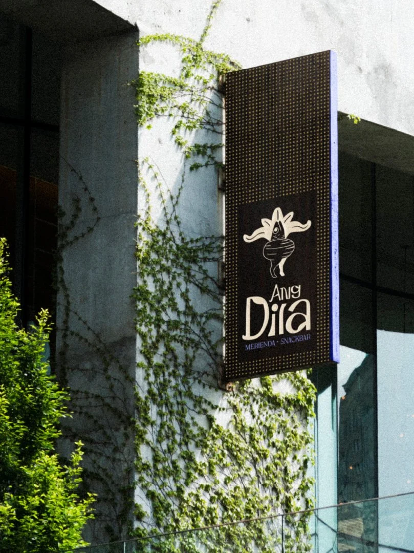
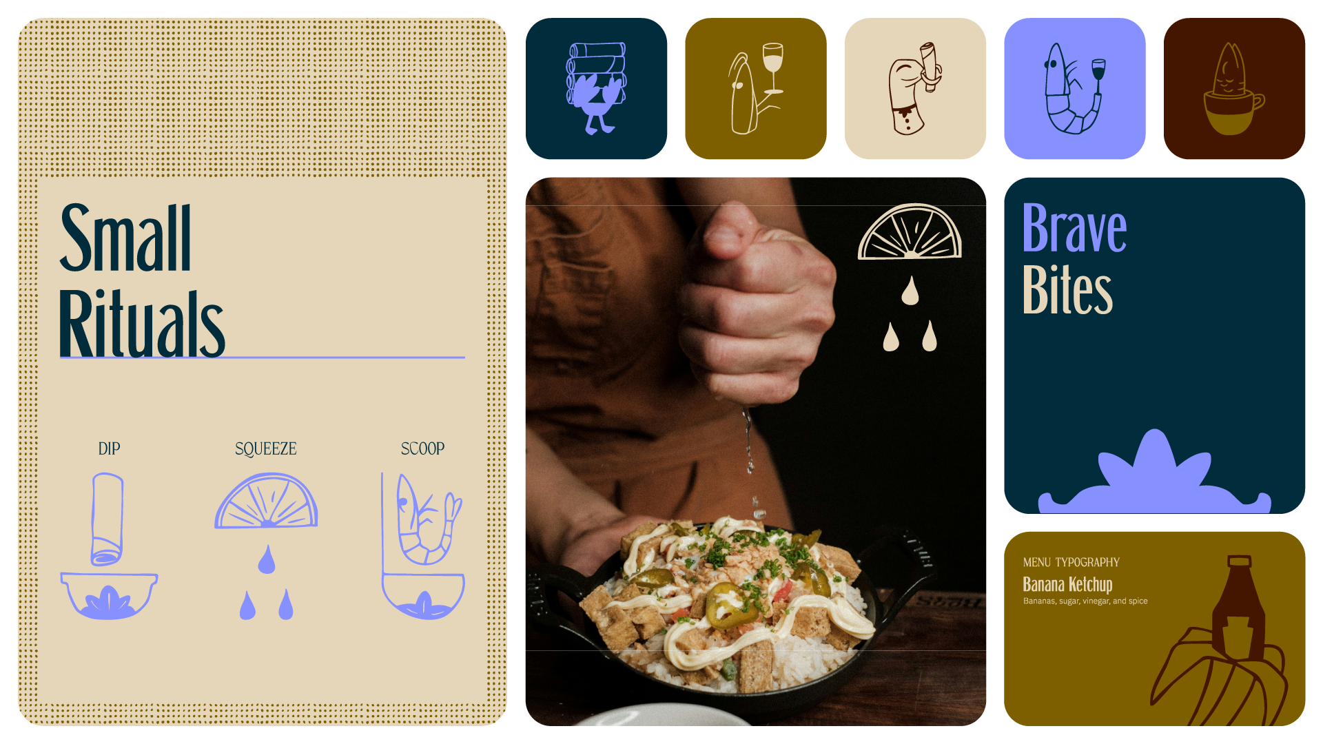
From “squeeze calamansi” to “scoop bagoong,” small rituals guide first-time diners through unfamiliar bites.