Two Lions Dentistry
Concept Direction
Logomark Design
Brand Identity Exploration
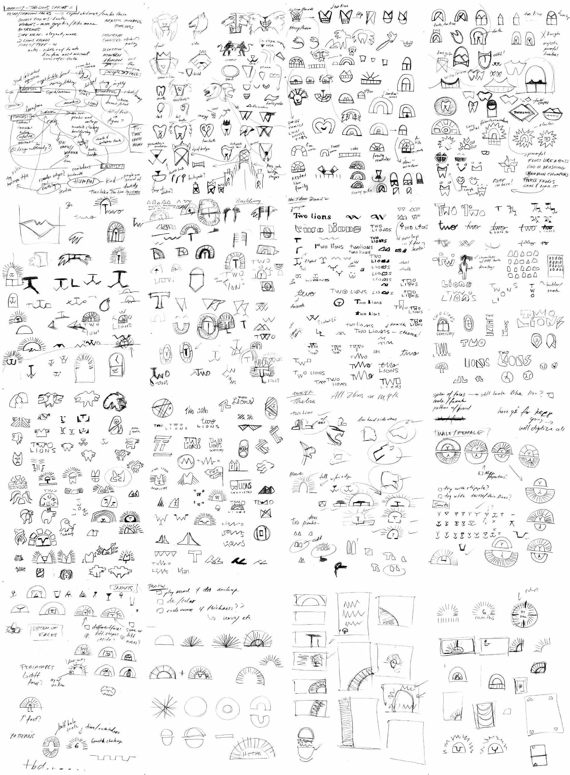
Sketches & Visual Development
A dual lion mark for top tier, approachable care for a modern dental practice.
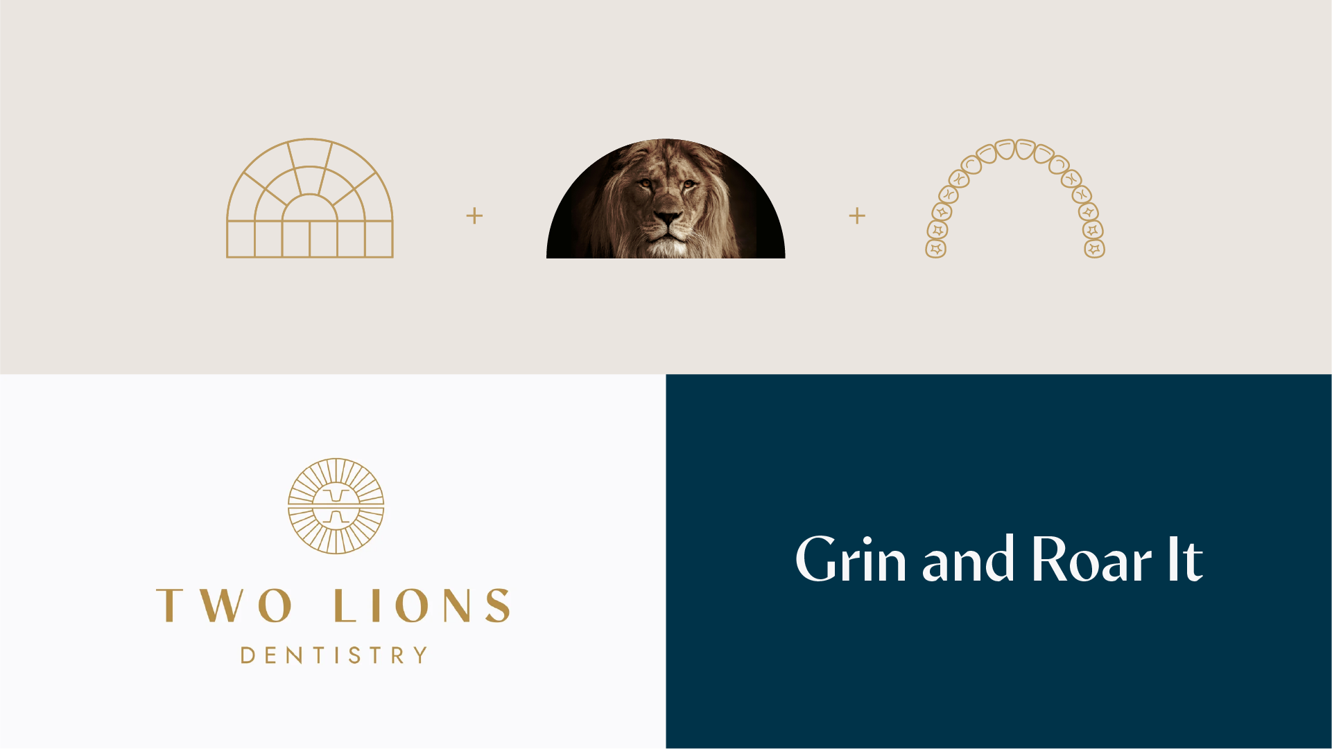
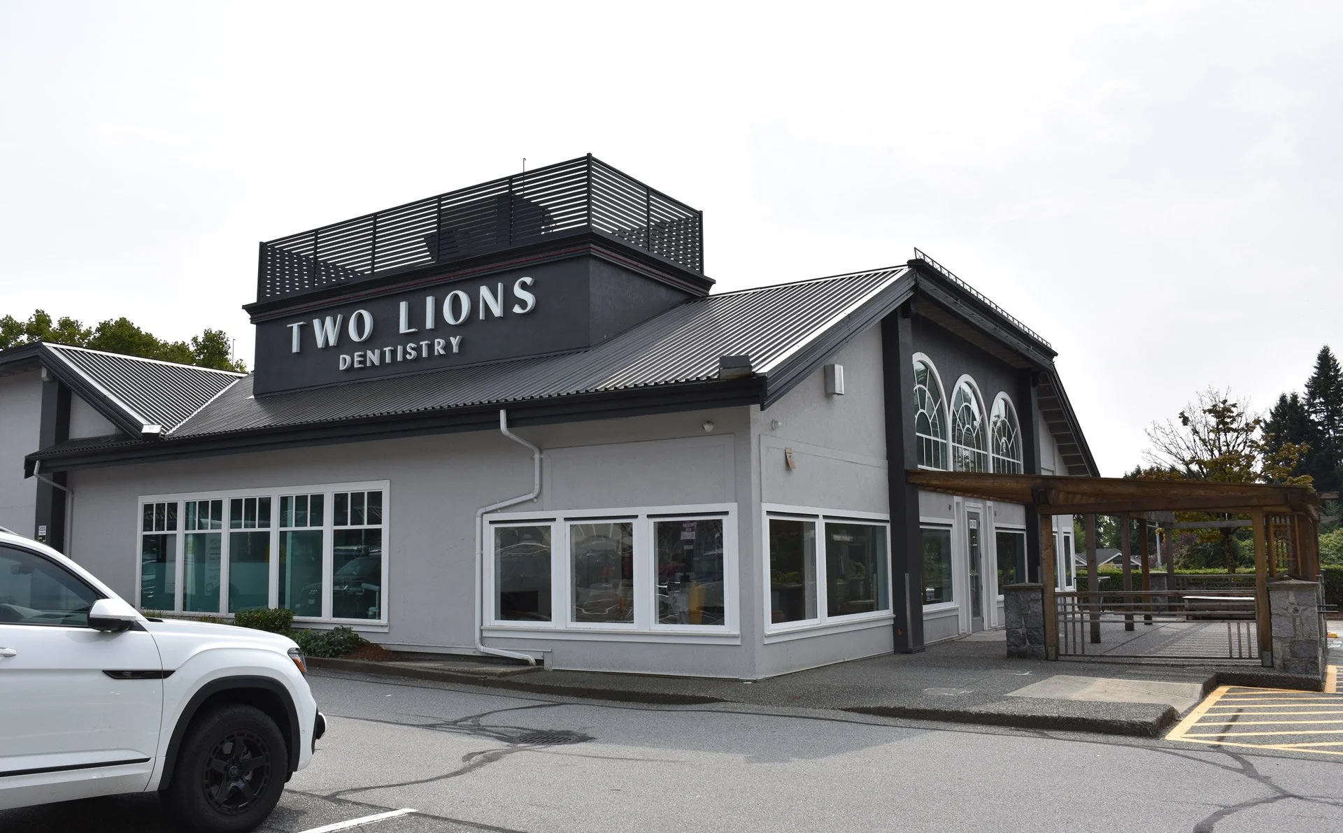
Two Lions Dentistry needed a brand identity that could stand apart from the sea of tooth icons and signal top tier, more luxurious care while remaining approachable. Inspired by the iconic twin peaks of Vancouver’s Lions mountains and the arched window of the former Two Lions Public House building, the logomark combines two balanced lion heads with 32 segments representing a full set of adult teeth. The form hints at sundials, time, and reflection. The result is a balanced emblem that conveys strength and warmth, offering a gentle roar of reassurance and friendly reminders.
Completed during my practicum at Rethink, this case study shows the selected concept direction, along with my broader logomark exploration. Final production and website development were carried forward by the Rethink team after the practicum.
-
Completed at Rethink
Creative Director | Hans Thiessen
Creative Director | Alex Bakker
Art Director | Ashley Visvanathan
Designer | Tulio Pinto