Chilliwack Museum & Archives
Concept Direction
Brand Identity Exploration
Reframing a museum as a community hub, inspired by the historic Five Corners.
-
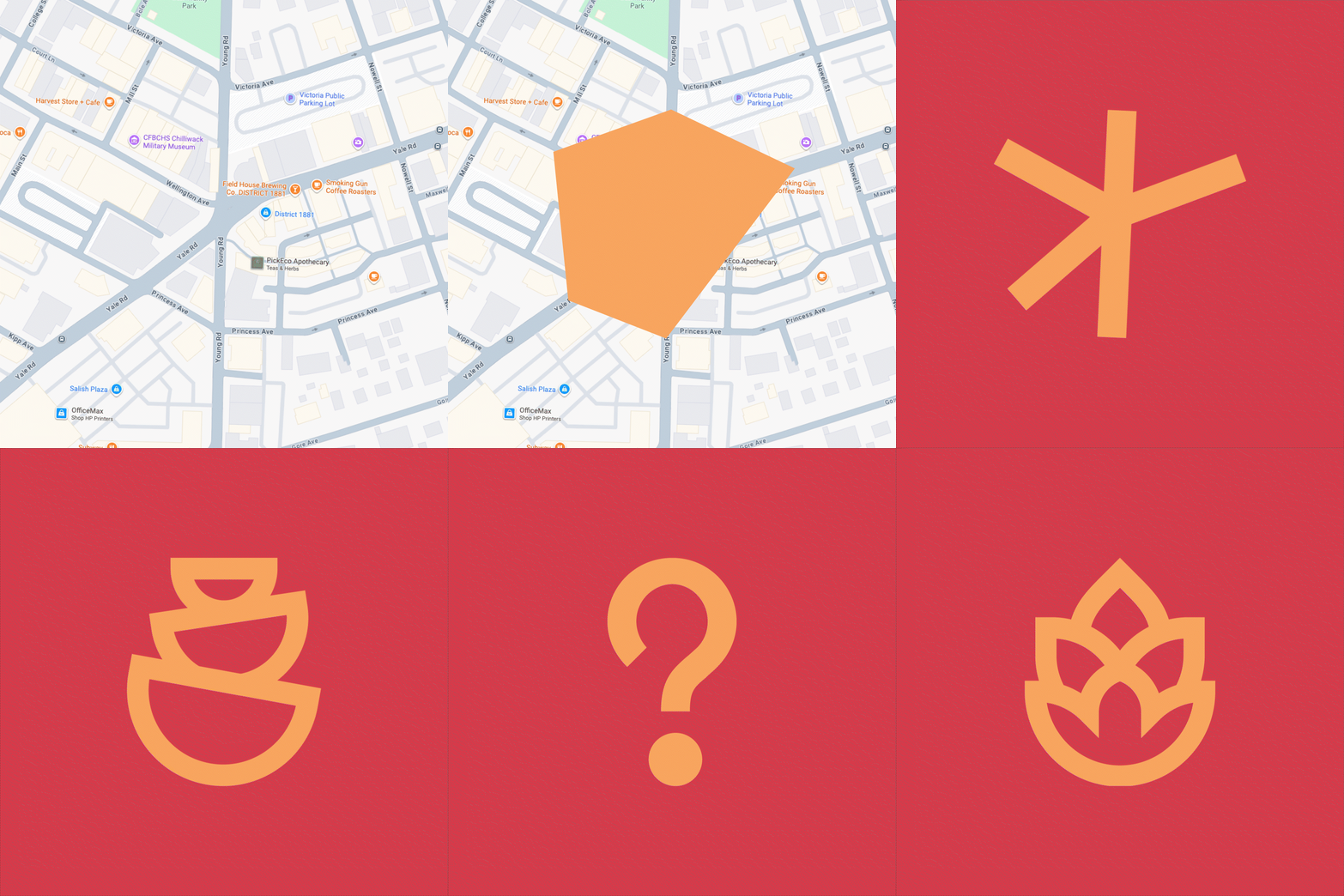
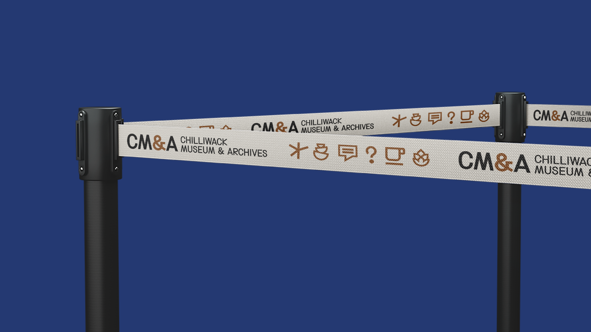
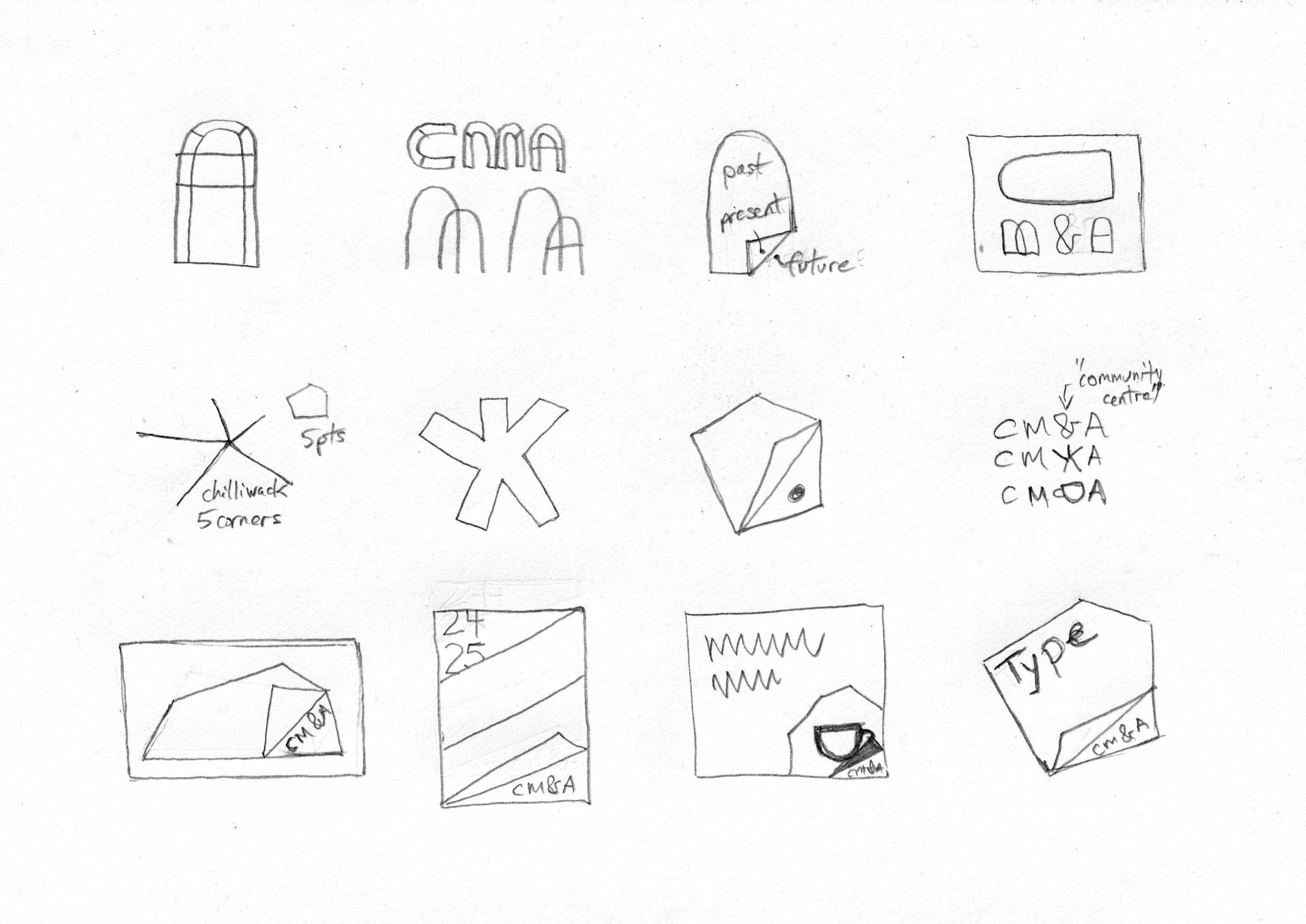
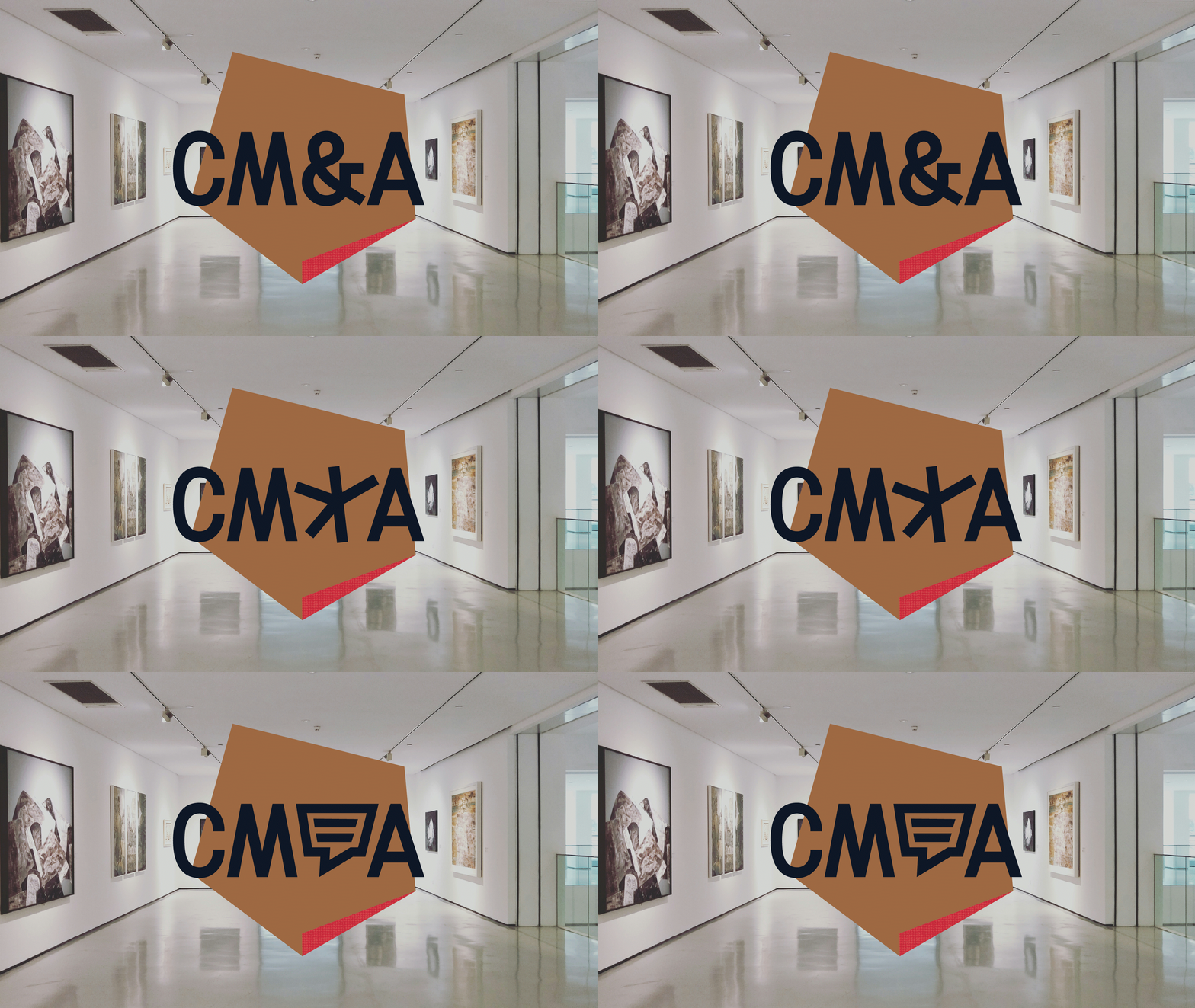
The museum functions not just as a museum. By using the visual language of community centre icons and referencing the historic Five Corners intersection, the design expresses its role as a hub where the past is experienced and the future engaged.Inspired by the historic Five Corners intersection in Chilliwack, this branding direction embraces the museum not just as a keeper of artifacts, but as a vibrant place of connection, more like a community centre than a traditional institution. Unearthed fragments found at the Algra Brothers redevelopment site at Five Corners became a metaphor for the design, peeling back the layers of place and revealing stories beneath. With icons, folds, angles, and pentagon forms that echo both the intersection and the uncovering of history, these corners invite curiosity and connection. “CeeMa,” the museum’s would-be nickname, signals its evolving role. Background and research included a visual audit and landscape review, and strategy work covering target markets, SWOT, goals, objectives, key messages, visual cues, keywords, and a tagline.
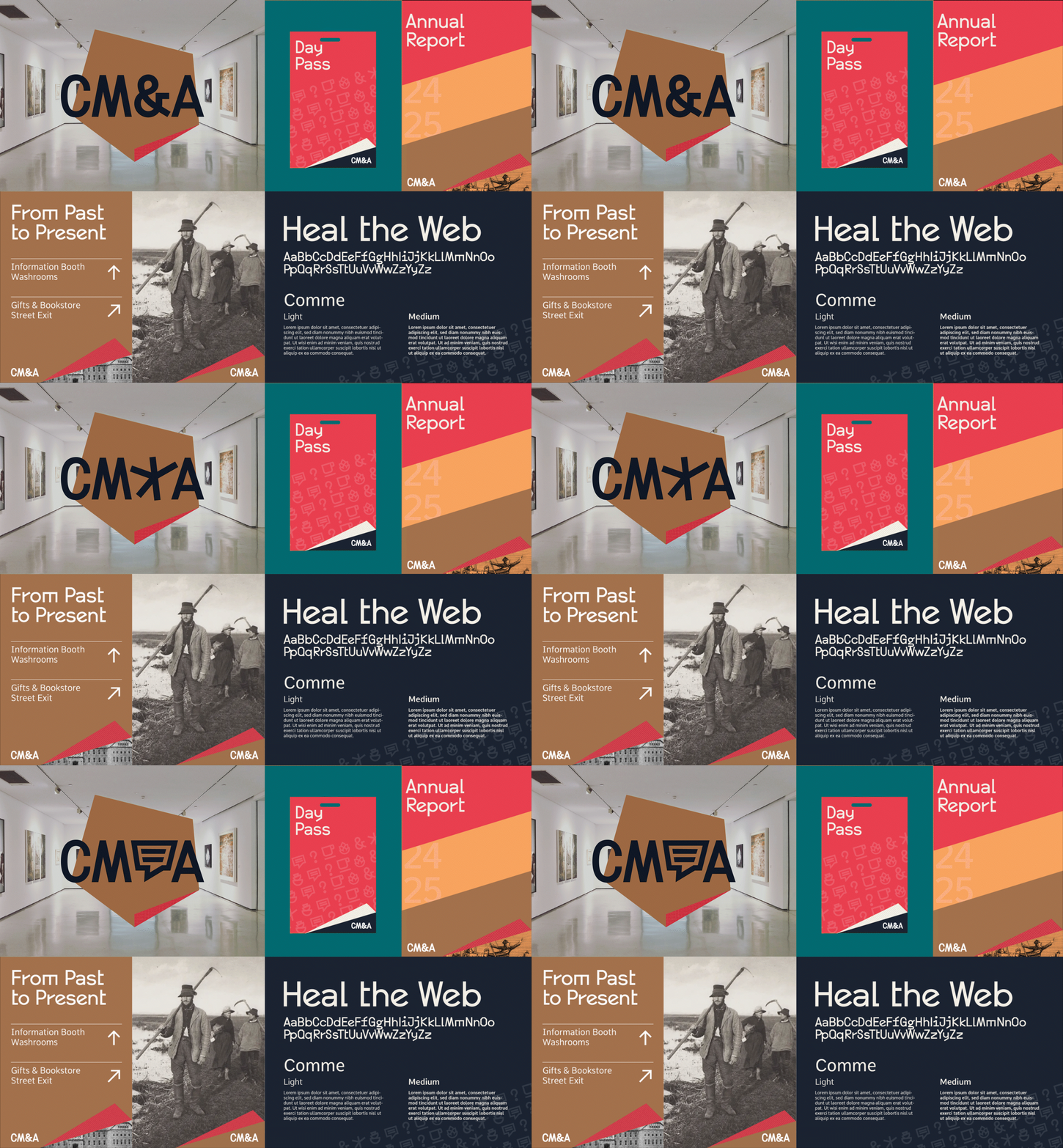
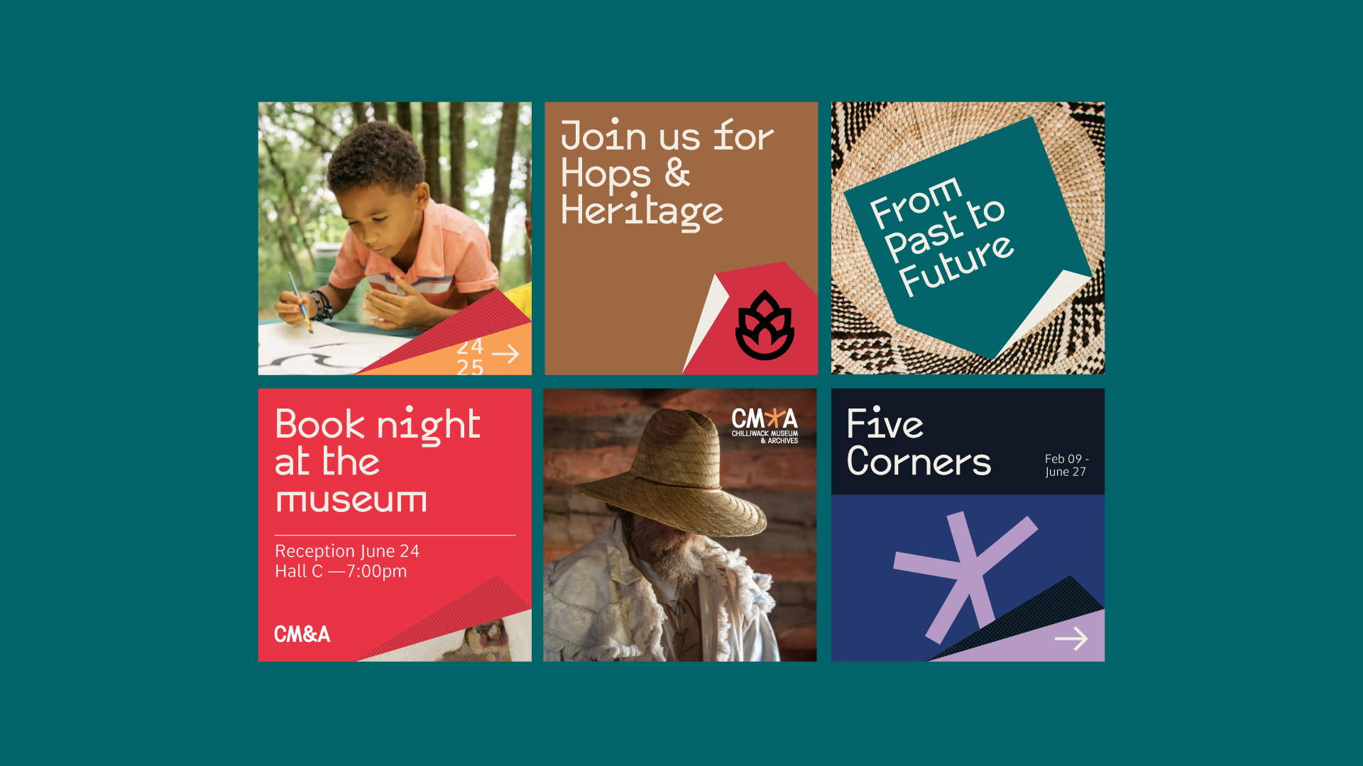
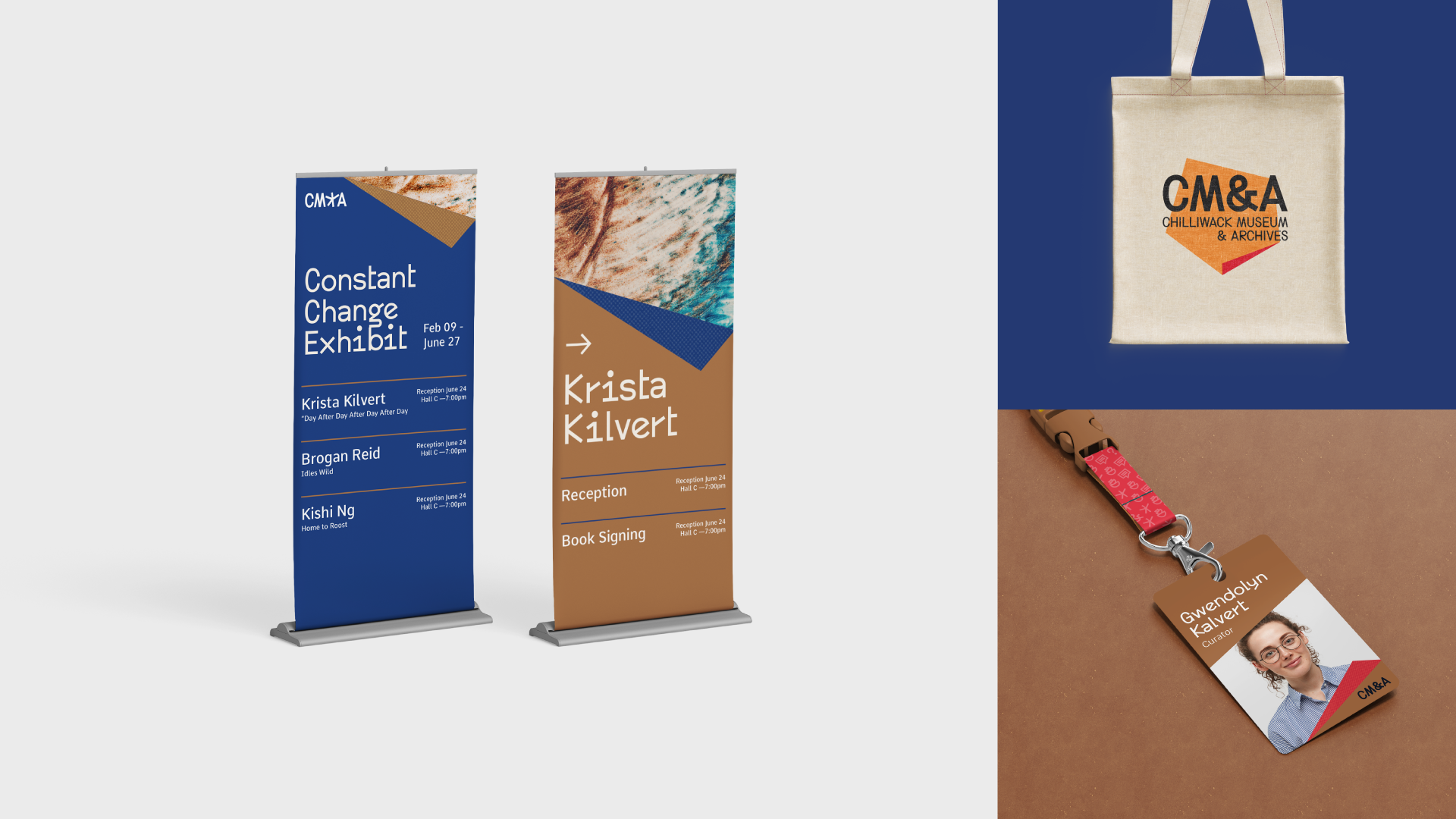
The system is built from modular pentagon shapes that fold and flex across applications, allowing for dynamic layouts, layered storytelling, and icon-based navigation. Custom icons reflect the museum’s broad programming, drawing on the visual language of community centres. These can be used as standalone markers or as patterned textures. The palette combines bright yet grounded tones, balancing youthfulness and sophistication. The typography reinforces clean angles. This direction emerged as the strongest client-facing option after an earlier route was set aside, but a key staffing change ultimately paused the project at that time.
-
Completed at Ion Brand Design